The One2Target Demographics report reveals breakdowns and side-by-side comparisons of demographic data for selected domains across specific time periods and locations.
With the Demographics report, you can understand:
- Audience age and sex distributions
- Trends in unique visitors to selected domains
- Top audience locations and growth by location over time
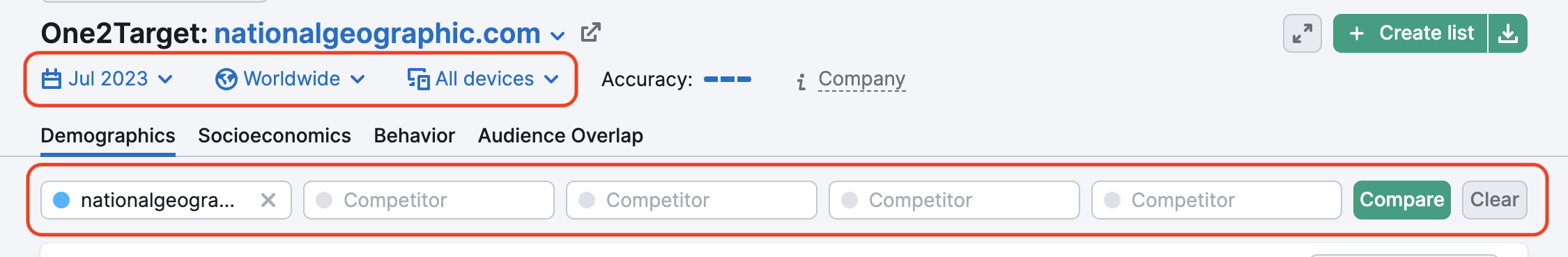
To begin, enter up to five domains to compare. Once you enter your selected domains, make sure you’ve also defined your desired timeframe, location, and device type at the top of the report.
Audience
Once you’ve entered your market domains and defined your timeframe, location, and device type, you’ll first encounter the Audience graph, which displays the age and gender breakdown of your audience.
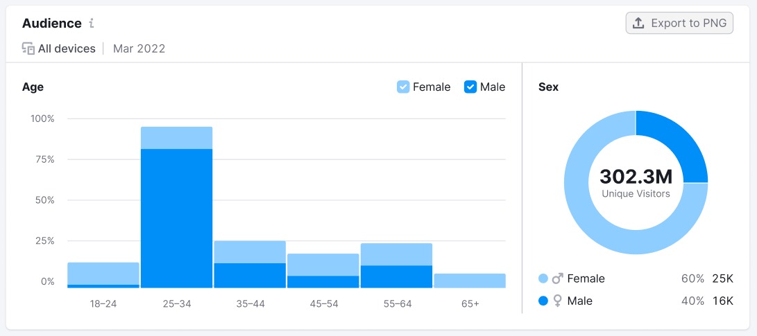
This widget provides data related to audience age brackets to the left. To the right, you’ll discover the breakdown of the audience by sex. The horizontal axis indicates the age segments of your audience. The vertical axis tells you what percentage of your audience falls into each of these categories.
The Sex graph to the left shows the breakdown of female and male members of your audience. It includes the total number of unique visitors, as well as the share and number of each sex.
Unique Visitors
Next, you’ll find the Unique Visitors graph. This graph shows the trend of unique visitors from the market audience to your selected market domains. You can view data points on the graph by month or quarters and choose to display data for the past 6 months, 1 year, 2 years, or All time.
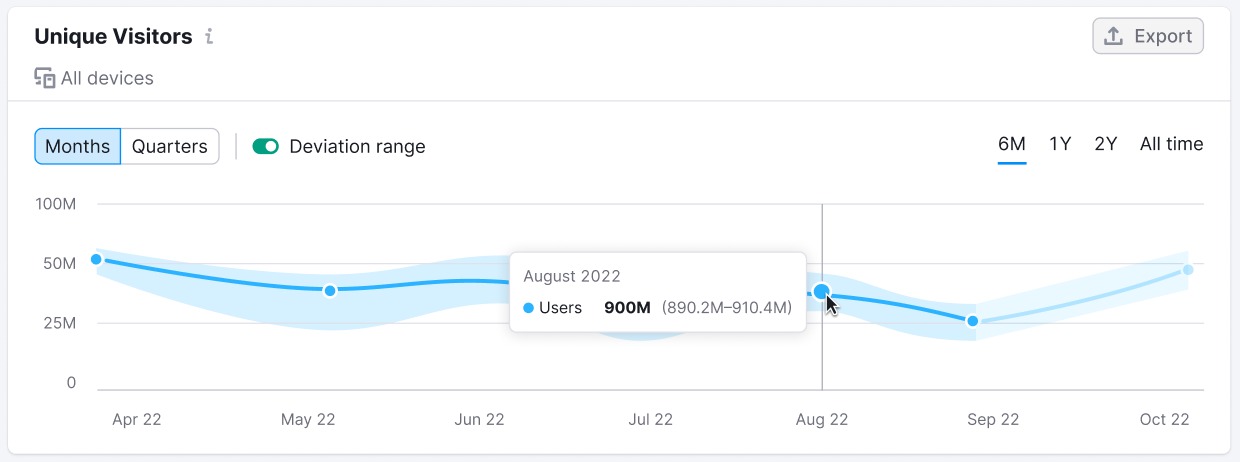
The line in the Unique Visitors graph reveals the deviation range, depicted above in light blue on either side of the dark blue line. The deviation range is the difference between the highest possible number of unique visitors and the lowest. If you’d like to view the graph without the deviation range, click the deviation range switch above the graph.
Distribution
Finally, you’ll find the Distribution chart. Here, you can explore the top countries and regions where your audience is located. Next to the top countries, the chart reveals the breakdown of the audience for each country by share and number of users.
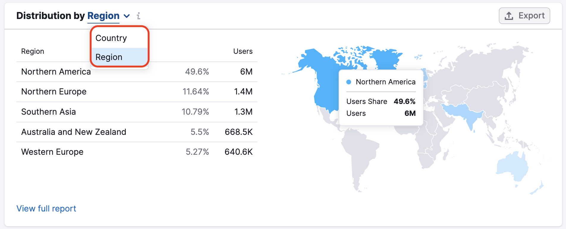
To view more specific data related to audience location, you can click the link at the bottom of the chart to jump over to the Traffic Analytics tool.
With any of the above widgets, you can download the charts in PNG or CSV formats. Data from Unique Visitors and Distribution widgets can also be exported to Google Sheets. To select a file type, click the “Export” button and choose an option from the dropdown menu.